Why Most Charity Websites Lose Donors Before They Click “Give” (And How To Fix It)
Is your charity website optimized for giving? Discover why you may lose donors before they give – and how to change that.

Is your charity website optimized for giving? Discover why you may lose donors before they give – and how to change that.

Every charity works hard to inspire giving. Whether it’s to donate time, money, or resources, motivating your audience to take action is crucial to supporting your mission.
But with the internet more crowded than ever, many nonprofits struggle to convert website visitors into actual donors. The frustrating truth is that most charity websites lose potential donors before they even click the “Give” button.
Understanding why this happens is essential! With fewer people donating in 2025, it’s more important than ever for your charity to make the process smooth for those who are.
We’ll show you how!
The digital donor journey can be a bumpy ride. Visitors to your charity’s website usually come with good intentions but may have limited time or patience.
They want to quickly understand who you are, why your cause matters, and how they can help. If they can’t find this or if the experience is frustrating, they will leave – possibly forever!
Here are the top reasons most charity websites lose donors before that vital “Give” click.
When visitors arrive at your site, clarity is key. Unfortunately, many charity websites suffer from jargon-heavy or overly complex messaging. Potential donors need to quickly grasp:
Long paragraphs, mission statements full of buzzwords, or contradictory calls to action can confuse visitors. They shouldn’t have to work hard to understand your message.
In other words, convoluted messaging can leave website visitors skeptical, making them less likely to follow through with a donation.

Even the most compelling cause can’t overcome a frustrating website. Confusing menus, broken links, and slow loading times negatively impact conversions.
Donors want a smooth, straightforward experience. They want to find the donation page easily, navigate your site with confidence, and have their questions answered quickly.
Giving is an emotional act, and people tend to donate because they feel connected to a cause. But many nonprofit sites miss this crucial point.
If you’re too preoccupied with showcasing service information and statistics, it’s all too easy to forget the stories. It’s important to showcase both the facts and faces behind your mission. Remember to continually demonstrate the human impact.
With over half of web traffic coming from mobile devices, a site that isn’t mobile-responsive is effectively shutting out a large segment of donors. If your donation form is hard to use on a smartphone or your pages don’t display correctly, potential donors won’t wait around.
Potential donors need to know their money is in safe hands. If your website lacks trust signals like clear privacy policies, an SSL certificate, charity registration information, or secure payment methods, visitors hesitate to proceed.
Even if someone is ready to give, a complicated or lengthy donation form can kill momentum. Too many fields, confusing options, or unclear payment methods lead to abandoned donations.
Fixing these common problems doesn’t have to mean a complete website overhaul (though sometimes it helps!). There are proven ways to optimize your charity website so visitors stay, connect, and – most importantly – give.
Use clear, concise language that immediately tells visitors who you are and why your work matters. Start with a strong, emotionally resonant headline on your homepage that gets straight to the point.
When writing web copy, use simple, jargon-free language throughout. Using bullet points or short sections can also help make information easier to digest.
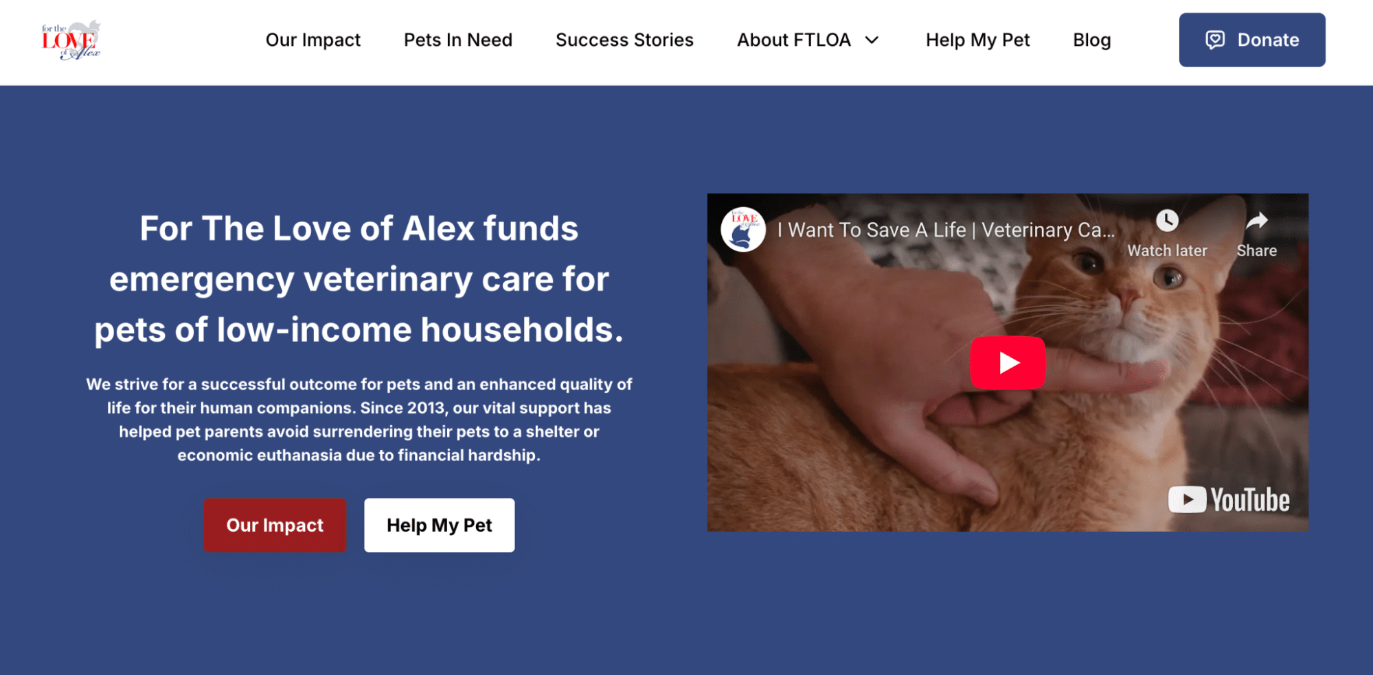
For the Love of Alex’s website is a great example of a page that prioritizes punchy, direct copy and logical menu design:

Ensure your site is easy to use with key features and a straightforward layout:
Regularly test your site on different devices and browsers to ensure you’re seeing what potential donors see. Recreate that customer journey to identify weak areas throughout the process.
Nothing builds connection like real stories. Tell these stories by using images and videos of people you’ve helped – or actors representing them – to bring your impact to life.
Include testimonials and quotes from beneficiaries, volunteers, and supporters to show your donors the tangible difference their gifts make. Knowing exactly where their donation ends up can increase their likelihood of donating.
For example, MedGlobal shares stories of their impact through their blog on their website, providing an engaging narrative to better understand their work.

In a recent study on donor behavior, researchers discovered that when people see how a nonprofit’s work can contribute to solving an issue, they are more likely to donate. Help website visitors see the wider impact of your mission.
Make sure your website is fully responsive, meaning it automatically adjusts for smartphones, tablets, and desktops.
Simplify forms and navigation for smaller screens so the mobile experience isn’t an afterthought. Fast loading speeds on mobile are also essential to reduce the donor drop-off rate.
Add clear, visible trust signals throughout your website. This helps add credibility to your organization and reassures donors that their details and donations are safe.
Some examples of trust signals include:
As a good example, see how Project Street Vet’s homepage displays their founder’s CNN Hero of the Year Award right next to their donation form:

As well as giving people the confidence to donate through your website, another added benefit is that websites demonstrating trustworthiness are more likely to rank higher in Google search results.
Make giving as effortless as possible:
Donorbox’s multi-step donation forms provide a quick and easy checkout experience for your donors, increasing conversion rates and bringing in more funding for your mission.
Websites are never complete, and you should continuously optimize your charity’s site. Start by using tools like Google Analytics and heat maps to see where visitors drop off.
Collect valuable feedback from your donors about their experience to help identify areas for improvement. Then, use this data to test changes with A/B experiments such as different headlines, layouts, or donation flows.
The nonprofit sector is more competitive online than ever before. With more organizations vying for donors’ attention and funds, your website is often the first (and sometimes only) chance to make a positive impression.
A website that loses donors before they click “Give” is a missed opportunity to grow impact and change more lives.
But with clear messaging, an intuitive user experience, emotional storytelling, mobile optimization, and an effective donation platform like Donorbox, your website can become your most powerful tool for driving donations and engagement!
At Few and Far, we believe every charity deserves a website that truly works hard to support their mission.
That’s why we created the Impact Optimiser – a free, expert consultancy service where we audit your charity’s website, user journeys, messaging, and accessibility. Learn more.

Subscribe to our e-newsletter to receive the latest blogs, news, and more in your inbox.

